

ProtoType
ProtoType
Info
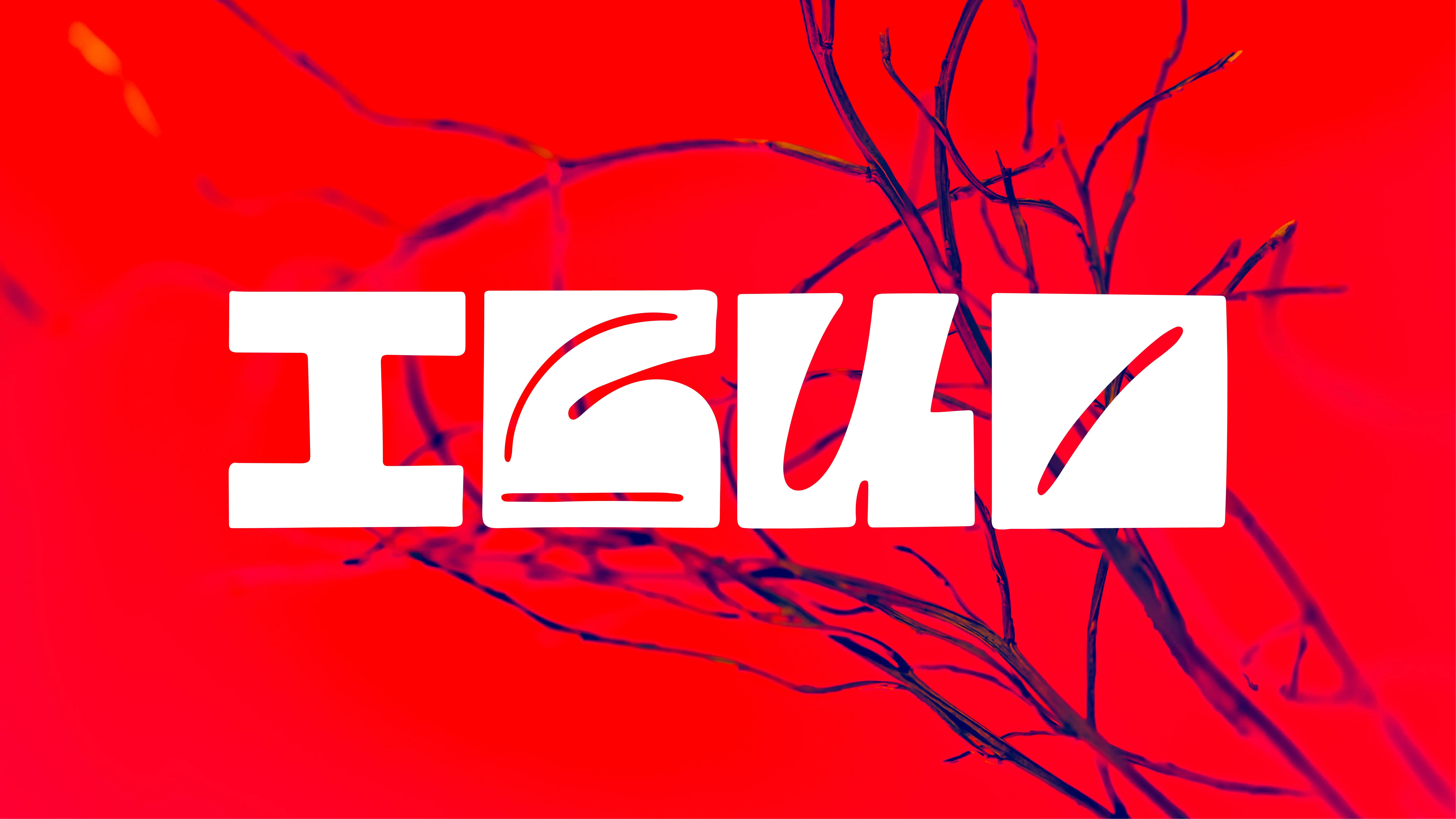
ProtoType is based on typographic research and experimentation in a variety of mediums. We explored how we can form letters using conventional and unconventional techniques such as sound or light. This project offers a fresh perspective on typographic design, demonstrating its flexibility and challenging innovation and exploration.
Sonofon is what happens when you take the dusty old rule — “letters are static shapes” — and stage-dive on it with a screaming guitar solo. We kicked things off with the bare-bones rig: electric axe, amp, mic, DAW. Then we went full throttle: every note, every tamed feedback loop got sampled as raw visual DNA. Drop the riffs into Audition, scrub the background hiss, and you’re left with naked waveforms. Export. Illustrator. Sculpt until each contour reads like the skeleton of a letter, still buzzing with the inertia, attack, and decay of the sound that birthed it. Twenty-six glyphs, four weights mapped to amplitude — an alphabet that literally throbs when you look at it. Proof that sound doesn’t just describe type; it becomes type.
Mid-flight we hit the big question: “How readable is too readable?” Answer: leave a little chaos in the mix. Edges stay scuffed, curves keep their spectrogram scratches, spacing drifts like a metronome someone’s nudging live. The result isn’t just a font —it’s an experience that demands speakers at the gallery. Drop it in a UI or on paper and you’ll swear you can hear a soft fuzz giving the copy emotional grit.
Different rebel, same attitude. MetaMorph starts with one geometric module — think a 3-D pixel fresh out of boot camp. Phase one: disciplined. Core alphabet, three weights, neat and tidy. Then we smashed the Mutation button: controlled distortions, rotations, extrusions, deliberate glitches until the module forgot it was ever “correct.” Every stage got saved, mapped, compared so we could chart how far you can bend type rules before readability taps out.
And yeah, we yanked it off-screen. Intermediate sets got printed on plexiglass, blasted with raking light, letting the shadows do the talking. Some glyphs only flex their muscle in real space. MetaMorph is accelerated evolution: from strict grid to liquid form, proving a minimal lattice can spawn an entire family with split personalities — boardroom-friendly at weight one, brutalist anarchist at weight three. In branding? That’s extreme elasticity: one asset, a truckload of attitudes.
Both projects declare the same truth bomb: typography isn’t a handbook — it’s a playground, and the rules are negotiable. Sonofon shows sound carving genuine letters; MetaMorph shows a pixel surviving creative torture to tell a visual epic. Two roads, one takeaway: push hard enough and type quits being a static object and grows into a living organism — and yeah, it’s still totally legible.
Services
Services
Type
Type
In House
In House
Client
Client
In House
In House
Year
Year
2023
2023
Creative
Director
Creative
Director
Teodor Moisescu
Teodor Moisescu
Teodor Moisescu
Design
Design
Teodor Moisescu
Teodor Moisescu
Team
Team
Radu Manelici
Radu Manelici
Radu Manelici
Development
Development
AZERO
AZERO
More
projects


Brand Identity
Artis Vivid
Brand Identity
/
Web Design
chimedical


Brand Identity
Brătilești


Brand Identity
/
Logo
Moon Trades


Exhibition
/
Visual Identity
Natural Dyes Exhibition
Brand Identity
/
Logo
Webified


Brand Identity
/
Logo
Finstar


Brand Identity
/
Logo
Hobby Horse


Brand Identity
/
Web Design
Authari


Type
/
In House
IBUO


Art Direction
/
Web Development
Maldives Shoot


Brand Identity
/
Logo
MNIR


Brand Identity
Artis Vivid
Brand Identity
/
Web Design
chimedical


Brand Identity
Brătilești


Brand Identity
/
Logo
Moon Trades


Exhibition
/
Visual Identity
Natural Dyes Exhibition
Brand Identity
/
Logo
Webified


Brand Identity
/
Logo
Finstar


Brand Identity
/
Logo
Hobby Horse


Brand Identity
/
Web Design
Authari


Type
/
In House
IBUO


Art Direction
/
Web Development
Maldives Shoot


Brand Identity
/
Logo
MNIR