

Webified
Webified
Info
Meet Webified, a rising tech solutions company that blends top-tier software development, savvy Shopify optimization, and forward-thinking business automation into a single, seamless digital powerhouse. Their specialty? Transforming even the most complex ideas into high-performance, revenue-driving experiences that push growth-minded brands to the next level. Whether it’s a custom SaaS build or a cutting-edge Shopify store, Webified is all about giving businesses the strategic and technological edge they need to shine in a noisy, fast-moving market.
They needed a complete rebrand to position themselves as the go-to partner for high-growth businesses looking to dominate the digital space. Our mission? Give them a fresh, cohesive visual identity and brand strategy that screams, “We’ve got you, future disruptors!”
Before we stepped in, Webified was rocking a no-frills grayscale look and a pretty minimal brand vibe. Sure, it was functional, but it didn’t capture the bold, big-leap energy they bring to clients day in and day out. They wanted to be seen as more than “just a dev shop.” They needed:
A distinctive logomark flexible enough for everything from partner directories to “Powered by Webified” badges.
A visual identity that felt “cutting-edge” and “Y-Combinator backed,” emphasizing trust, quality, and easy-to-use innovation.
A brand personality that balanced tech-savvy seriousness with an approachable, strategic edge.
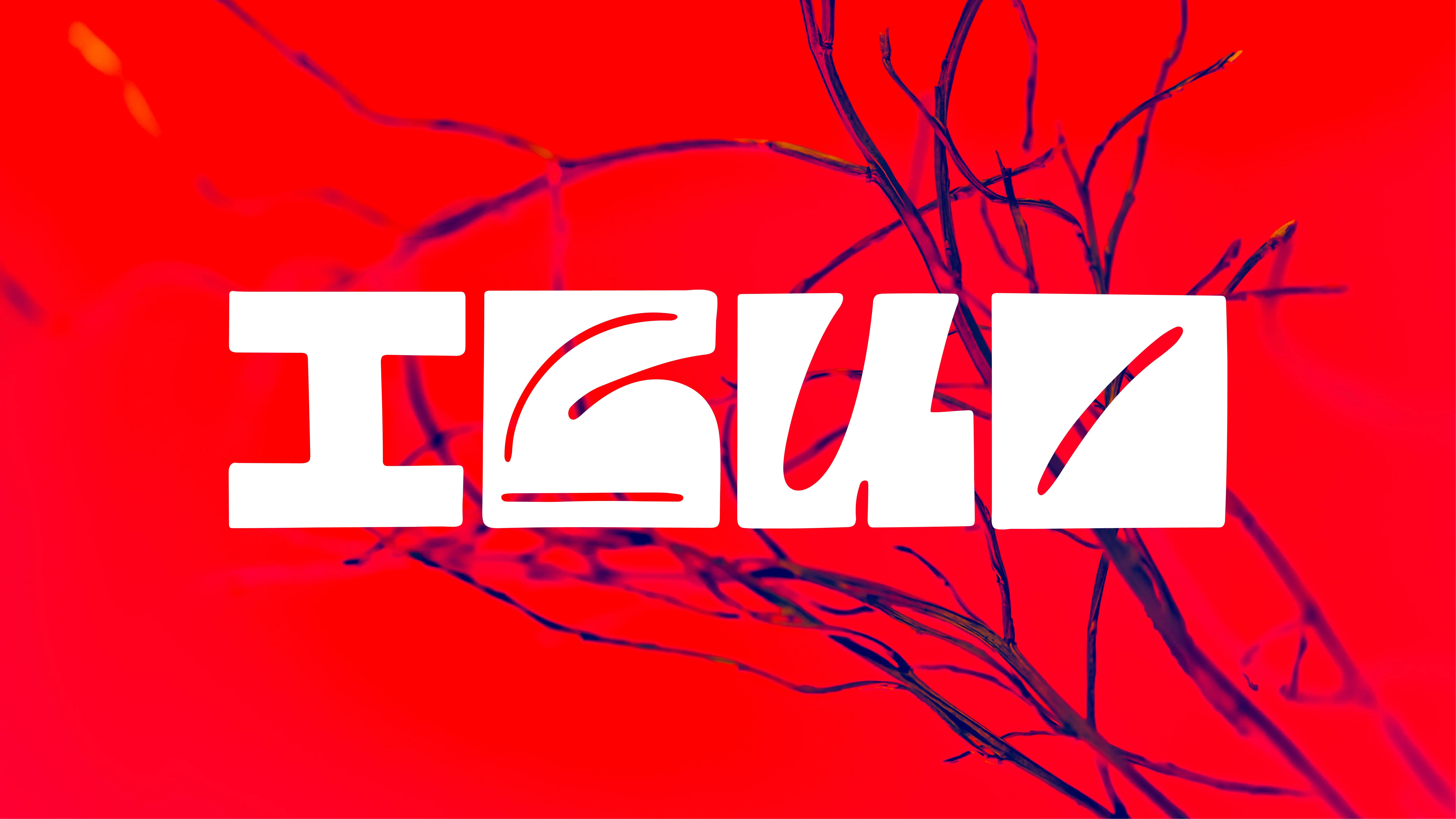
We focused on a sleek, geometric “W” to symbolize forward momentum, modernity, and digital transformation. The final wordmark is rounded and minimal, ensuring it stays user-friendly on screens of all sizes.
For the color palette, we leaned on neutrals (black, white, and gray) for that crisp, tech-forward vibe, then brought in subtle accents like slate and a deep navy for depth. This palette captures the understated confidence of a serious tech player while staying open to future expansions (e.g., “Powered by Webified” sub-brands).
The Supporting imagery features references of modern architecture, sleek metallic textures, and fluid shapes to echo the sleekness and flow of top-tier software experiences.
Prospective clients now see Webified as a true strategic partner, not just another dev shop. The brand exudes that “Y-Combinator vibe” they were craving, positioning them perfectly for bigger corporate clients and savvy startups.
Whether it’s on LinkedIn, a partner directory, or a “Built by Webified” badge, the brand identity is cohesive. One glance at the W icon or the high-contrast color scheme, and you just know it’s Webified.
A refined, contemporary brand presence signals, “We take our craft seriously, and we’ll do the same for your business.” That trust factor is crucial for high-stakes projects involving custom software and AI-driven automation.
Services
Services
Brand Identity
Brand Identity
Logo
Logo
Client
Client
Webified
Webified
Year
Year
2025
2025
Creative
Director
Creative
Director
Teodor Moisescu
Teodor Moisescu
Teodor Moisescu
More
projects


Brand Identity
Artis Vivid
Brand Identity
/
Web Design
chimedical


Brand Identity
Brătilești
Brand Identity
/
Web Design
LogoHex


Exhibition
/
Visual Identity
Natural Dyes Exhibition


Brand Identity
/
Logo
Finstar


Type
/
In House
ProtoType


Brand Identity
/
Logo
Moon Trades


Brand Identity
/
Logo
Hobby Horse


Type
/
In House
IBUO


Art Direction
/
Web Development
Maldives Shoot


Brand Identity
/
Logo
MNIR


Brand Identity
Artis Vivid
Brand Identity
/
Web Design
chimedical


Brand Identity
Brătilești
Brand Identity
/
Web Design
LogoHex


Exhibition
/
Visual Identity
Natural Dyes Exhibition


Brand Identity
/
Logo
Finstar


Type
/
In House
ProtoType


Brand Identity
/
Logo
Moon Trades


Brand Identity
/
Logo
Hobby Horse


Type
/
In House
IBUO


Art Direction
/
Web Development
Maldives Shoot


Brand Identity
/
Logo
MNIR