


Info
When the European Central Bank revealed the proposed designs for the next generation of euro banknotes, the work immediately sparked conversation across Europe.
The proposals represented far more than a new visual treatment for currency. They were potential pieces of everyday European culture — designed by talented designers, artists, and studios, and intended to be held, exchanged, and seen by millions of people. But the official presentation made the designs difficult to experience properly.
The proposals were shown inside a functional interface that offered limited visual context, reduced the impact of the artwork, and made comparison between the different directions unnecessarily difficult.
We believed the work deserved a better stage.
We created an independent digital showcase dedicated to the proposed new euro banknote designs. The goal was not to redesign the banknotes or influence the public towards a particular proposal. Instead, we wanted to present every design clearly, consistently, and at a scale that allowed people to properly understand the work before voting.
The website presents the proposals through a clean, editorially driven interface designed to make browsing and comparison effortless. Each design direction is shown with greater visual impact, allowing visitors to explore the banknotes as complete systems rather than isolated thumbnails.
The experience was designed to feel neutral, accessible, and intuitive — helping people compare the different proposals without distracting from the work itself.
The project moved quickly from observation to execution. This rapid process allowed us to respond while public interest around the proposed banknotes was at its highest, turning a design critique into a useful and accessible platform for the wider European design community.
The response was immediate. Within the first 24 hours, the project generated:
215,000+ views across the launch content
8,500+ unique website visitors
15,000+ page views
Beyond the numbers, the platform received overwhelmingly positive reactions from the public.
People actively shared the website, discussed their favourite proposals, and used the platform as an alternative way to explore the designs before voting.
The speed and scale of the adoption demonstrated that the audience was not only interested in the new banknotes — it was looking for a clearer and more engaging way to experience them.
It became a public-facing design platform that helped make an important European cultural conversation more accessible. The project showed how quickly thoughtful design can improve the way people engage with public information — and how a simple, well-executed digital experience can generate significant organic attention without a large campaign, media budget, or complicated product strategy.
Sometimes, the opportunity is not to create more content. It is simply to present important work with the attention it deserves.
When the European Central Bank revealed the proposed designs for the next generation of euro banknotes, the work immediately sparked conversation across Europe.
The proposals represented far more than a new visual treatment for currency. They were potential pieces of everyday European culture — designed by talented designers, artists, and studios, and intended to be held, exchanged, and seen by millions of people. But the official presentation made the designs difficult to experience properly.
The proposals were shown inside a functional interface that offered limited visual context, reduced the impact of the artwork, and made comparison between the different directions unnecessarily difficult.
We believed the work deserved a better stage.
We created an independent digital showcase dedicated to the proposed new euro banknote designs. The goal was not to redesign the banknotes or influence the public towards a particular proposal. Instead, we wanted to present every design clearly, consistently, and at a scale that allowed people to properly understand the work before voting.
The website presents the proposals through a clean, editorially driven interface designed to make browsing and comparison effortless. Each design direction is shown with greater visual impact, allowing visitors to explore the banknotes as complete systems rather than isolated thumbnails.
The experience was designed to feel neutral, accessible, and intuitive — helping people compare the different proposals without distracting from the work itself.
The project moved quickly from observation to execution. This rapid process allowed us to respond while public interest around the proposed banknotes was at its highest, turning a design critique into a useful and accessible platform for the wider European design community.
The response was immediate. Within the first 24 hours, the project generated:
215,000+ views across the launch content
8,500+ unique website visitors
15,000+ page views
Beyond the numbers, the platform received overwhelmingly positive reactions from the public.
People actively shared the website, discussed their favourite proposals, and used the platform as an alternative way to explore the designs before voting.
The speed and scale of the adoption demonstrated that the audience was not only interested in the new banknotes — it was looking for a clearer and more engaging way to experience them.
It became a public-facing design platform that helped make an important European cultural conversation more accessible. The project showed how quickly thoughtful design can improve the way people engage with public information — and how a simple, well-executed digital experience can generate significant organic attention without a large campaign, media budget, or complicated product strategy.
Sometimes, the opportunity is not to create more content. It is simply to present important work with the attention it deserves.
Services
Services
UX/UI
UX/UI
Web Design
Web Design
Client
Client
In-house
In-house
Year
Year
2026
2026
Creative
Director
Creative
Director
Teodor Moisescu
Teodor Moisescu
Teodor Moisescu
More
projects
UX/UI
/
Web Design
Sănătate la Feminin Website
Brand Identity
/
Web Design
chimedical
Label Design
/
Packaging
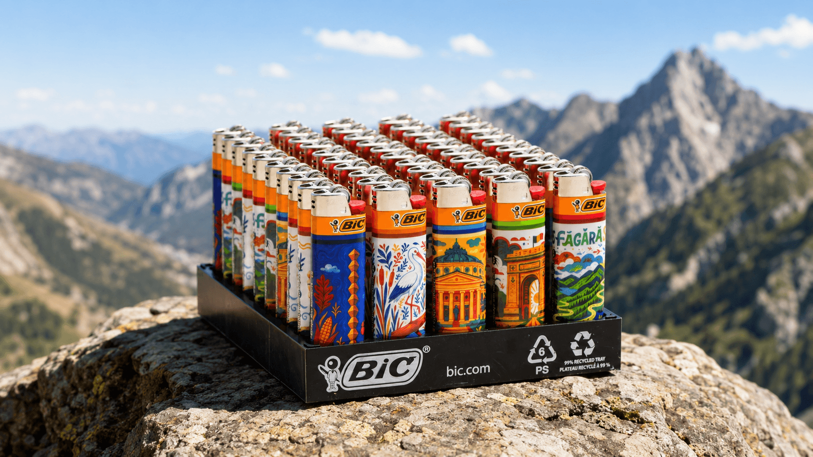
BIC Lighters Romania Collection
Brand Identity
Brătilești
Brand Identity
Artis Vivid
Exhibition
/
Visual Identity
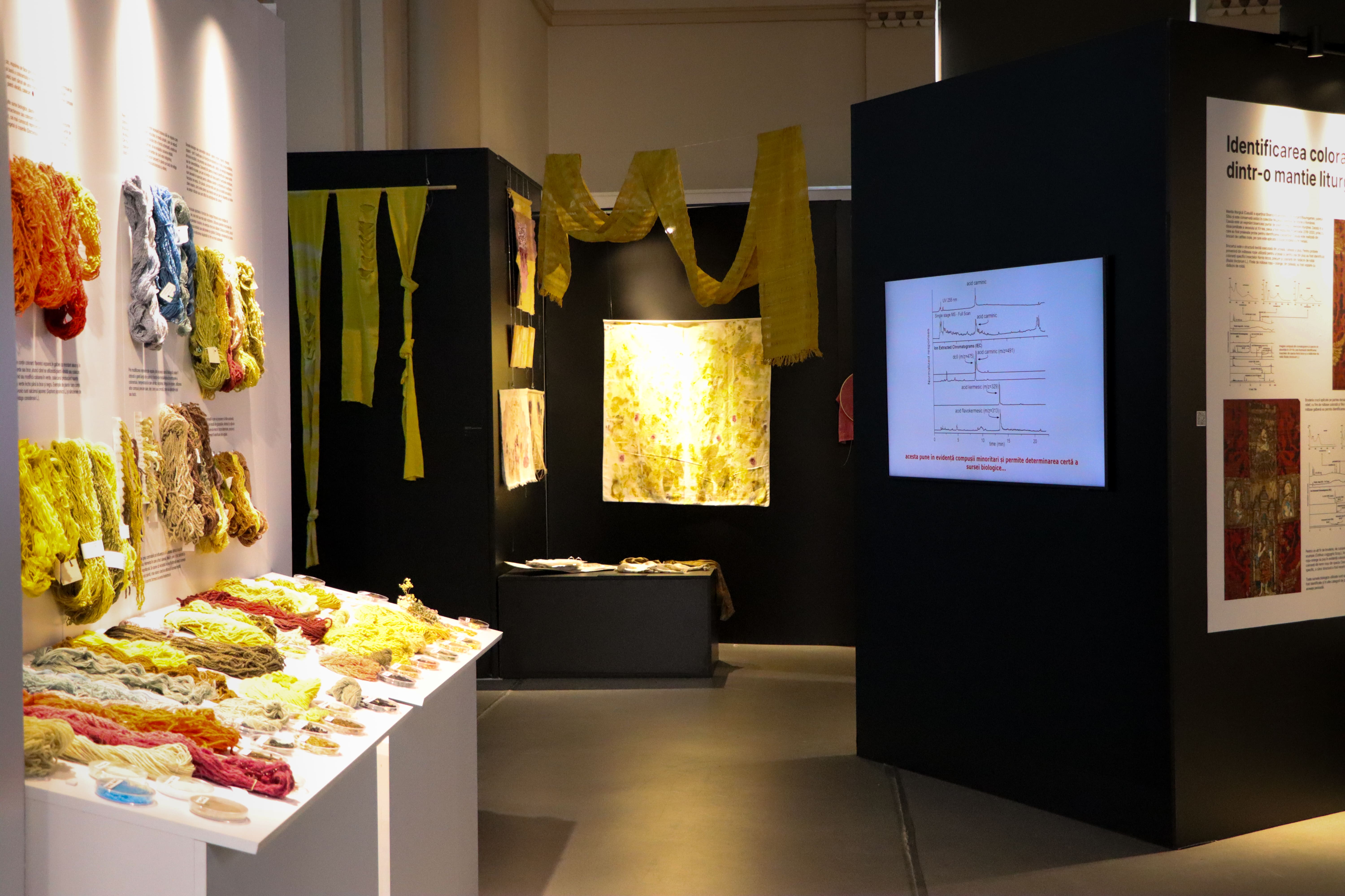
Natural Dyes Exhibition
Brand Identity
/
Web Design
LogoHex
Brand Identity
/
Logo
Webified
Brand Identity
/
Logo
Finstar

Brand Identity
/
Logo
Moon Trades
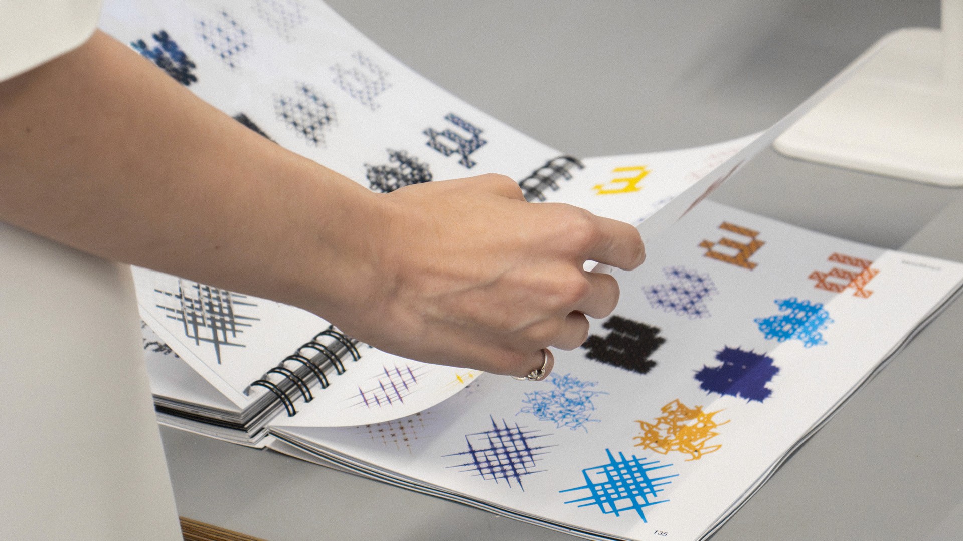
Type
/
In House
ProtoType
Brand Identity
/
Logo
Hobby Horse
Type
/
In House
IBUO
Art Direction
/
Web Development
Maldives Shoot
Brand Identity
/
Logo
MNIR
UX/UI
/
Web Design
Sănătate la Feminin Website
Brand Identity
/
Web Design
chimedical
Label Design
/
Packaging
BIC Lighters Romania Collection
Brand Identity
Brătilești
Brand Identity
Artis Vivid
Exhibition
/
Visual Identity
Natural Dyes Exhibition
Brand Identity
/
Web Design
LogoHex
Brand Identity
/
Logo
Webified
Brand Identity
/
Logo
Finstar
Brand Identity
/
Logo
Moon Trades
Type
/
In House
ProtoType
Brand Identity
/
Logo
Hobby Horse
Type
/
In House
IBUO
Art Direction
/
Web Development
Maldives Shoot
Brand Identity
/
Logo
MNIR